
Why the pressure plotting is so smooth compared with my simulation? Answered
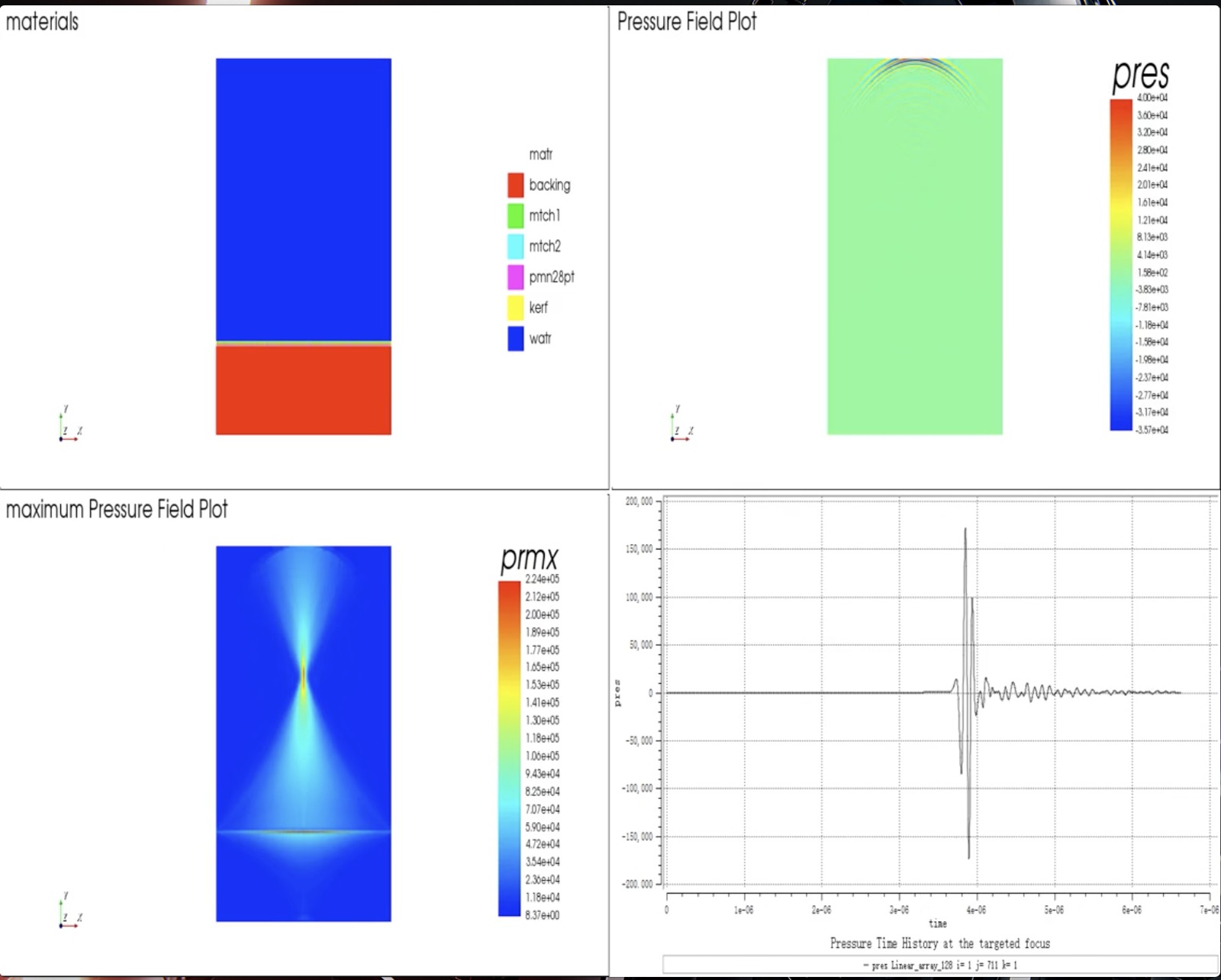 How to attempt the smooth display like the left bottom graph one? My design and result is here: https://drive.google.com/drive/folders/17G-MbsawR-cDVmboQgwPcdvJC7eZC5ZM?usp=sharing
Meanwhile, I want to ask that how to plot the graph as "prmx / pres" graph rather than "apmx"?
Thank you very much!
4 comments
Hi,
You can change the data range of the plot using the User defined data range:
Designer cannot output pres, this has to be done in Analyst by adding out pres to the data command. Prmx is the same as apmx just with a different name. You can change the names of the data arrays by copying them into a new array using data copy in Analyst.
Thank you. I also want to ask when I simulate my model, then observe the result like "apmx", the highest pressure always occur inside the transducer, but the example graph I mentioned above didn't, how to filter out the pressure of the transducer (the piezoelectric crystal)?
You can copy the maximum pressure in the water alone into a new data array using data cpyg (see command reference) and specifying the nodal indices of the water area.
Best Regards,
Chloe
But how to create a new data array? That is I don't know how to type the "datanameto" parameter.
Please sign in to leave a comment.
Didn't find what you were looking for?
New post